UX/UI Case Study
Rootbeer richie app design
The product
I wanted to create a ticketing app for the band ‘Rootbeer Richie and the Reville’, a band based out of Denver, Colorado. I wanted the users to be able to see when they are playing and buy tickets directly from the band all in one place.
Project Duration
April-May 2023
The Problem
Finding tickets for concerts in a reasonable time and at a reasonable price can be difficult, especially for small indie bands.
Responsibilities
User research, wireframing, prototyping
The Goal
I am aiming to make it easy, accessible, and rewarding to buy concert tickets to Rootbeer Richie and the Reville.
My Roles
Lead UX designer, UX researcher
User research
Before starting the design process, I wanted to understand what kind of experience the user wanted to have while exploring this website and what their frustrations could be during their experience browsing. I found four main pain points:
Financial, Process, Product, Support
Based on initial research, I created two personas with a problem statement for each:
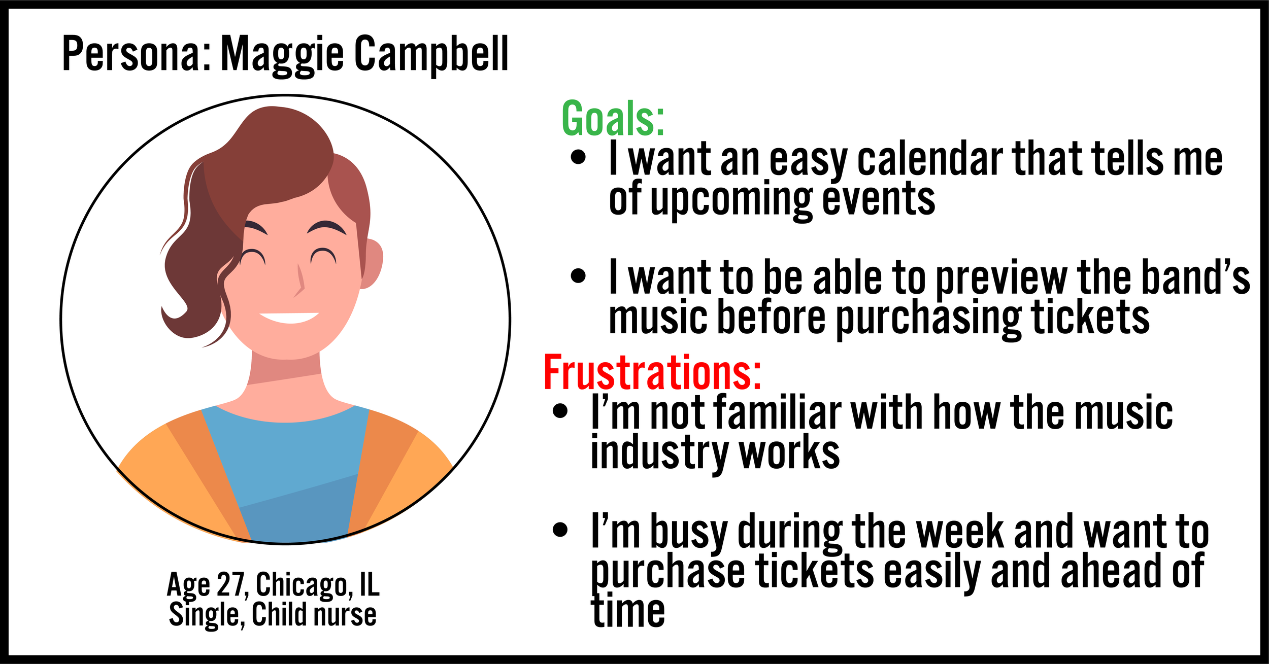
Maggie is a busy individual who needs an easy way to plan ahead because she doesn’t have time to spontaneously go to concerts.
Jerry is a community seeker who wants an easy and inexpensive way to share this band’s music with his peers .
Starting the Design
Based on initial research, I created a paper wireframe that met some of the user’s needs such as a calendar and an easy to buy option with a ‘featured’ section. I made the shows easily visible on the main page as well, which was another concern of users.
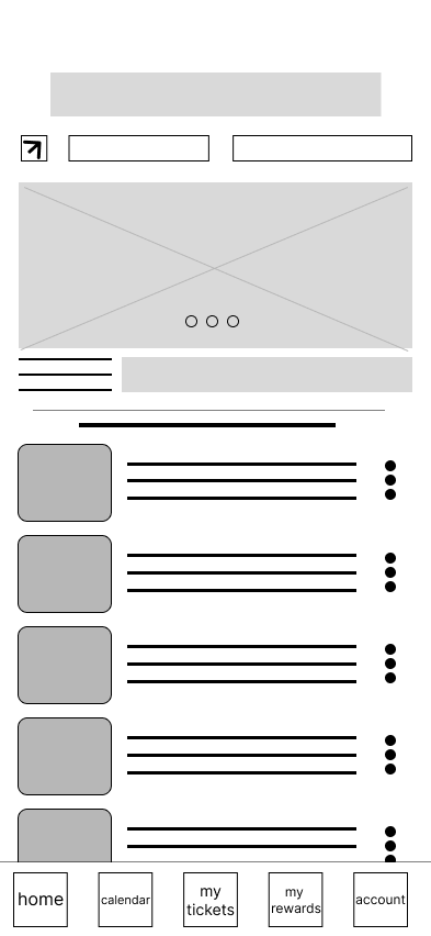
Paper Wireframes
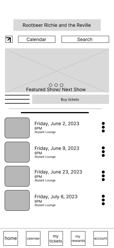
Digital Wireframes
Low Fidelity Prototype
Usability Research
In round one of the user research study, five people of different ages, gender and abilities were interviewed. This was an unmoderated study of 30-60 minutes.
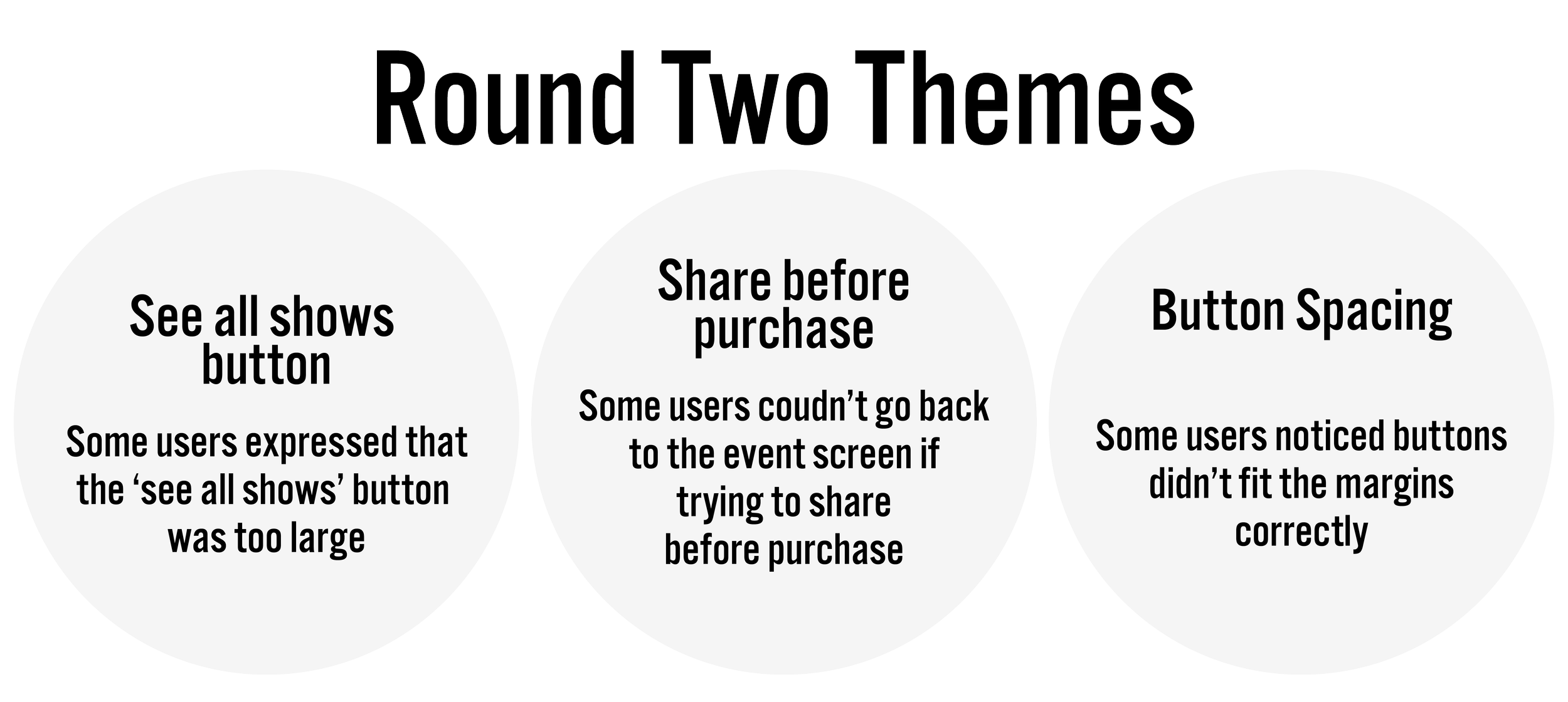
After the initial research phase, I came up with some insights that the research provided. Most were about the usability of the app itself. Other findings were just fine-tuning the way the app functions. I identified some common themes among the participants:
Mockups
Users were concerned that they did not get a review order screen ahead of purchasing tickets. They wanted to ensure their order accuracy. Users preferred the list style of calendar view over the grid-like calendar view. We changed the default calendar option to a list view. Both viewing options are still available.
Check out the entire hi-fi prototype here
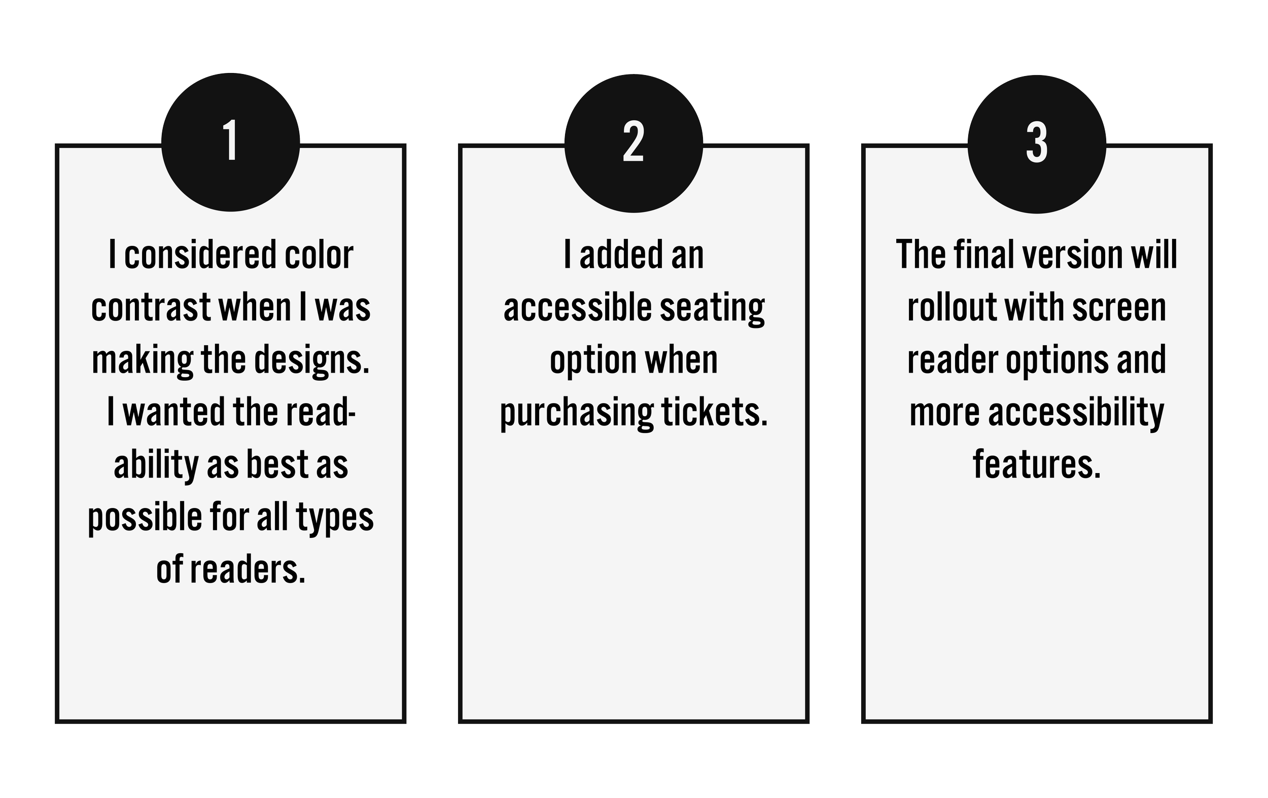
Accessibility Considerations
Impact
The designs were well received by participants of the study. Users showed happiness with the ease of use of the app and enjoyed the reward system offered.
Takeaways
One of the biggest things I learned was that not everyone will think the same way I do when it comes to design. There were some aspects that I thought made sense until it went into research.
Going Foward
The next step I would take with this project is to add more features for users to keep users engaged on the app. Some features might be an artist bio on each member of the band. Links to streaming services like Spotify would be added to let users listen to the band as they buy tickets.
Some other features I would add would be to include a page where users can see what restaurants are by the music venues so they can get food or drinks before the concerts. It would be integrated with a map app like Google Maps.
